Regulated fintech · Platform migration
Capital One Migration
A phased replatform of registration, billing and payments, moving more than a million UK customers off an inherited US system onto a platform the business could build on itself.

Role
Sole designer on the platform migration, end to end, from strategy and project definition through customer research to finished UI.
Team
None of the three designers I managed worked on this migration. Around 10 engineers were involved, with day-to-day contact mainly the back-end and front-end leads.
What I owned
Project definition with engineering, marketing, account management, customer service, programme and product counterparts. All the customer research and personas. All the detailed design.
What shipped
The phased migration of 1M+ customers onto a modernised, accessible platform.
Outcome
No spike in support call volume. Across my time at Capital One, core design work lifted NPS to more than 50% above the industry average. Helped Capital One retain its RNIB accreditation for web accessibility, which it had earned as one of the UK’s first banks.
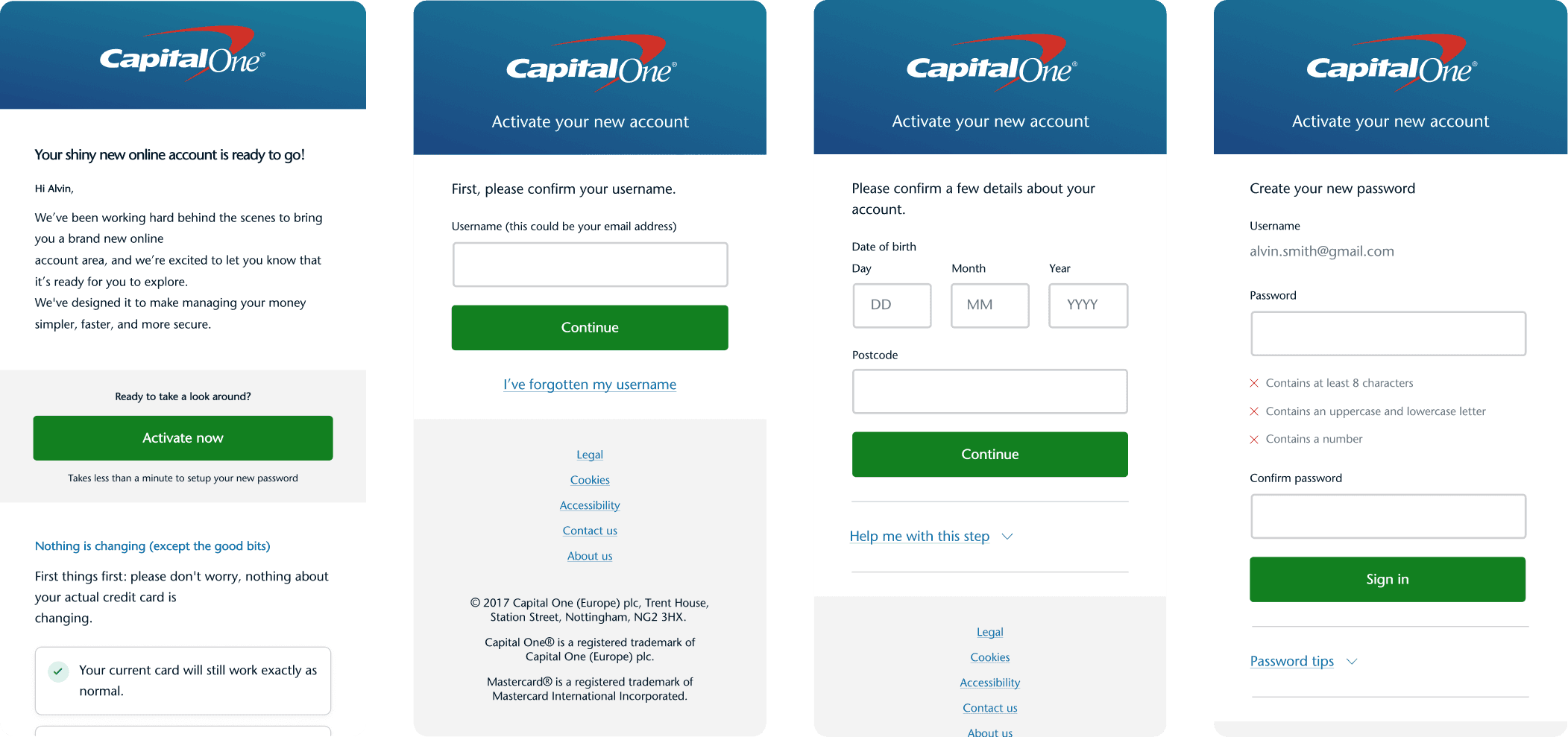
The steps in the order a migrating customer met them: the email, confirming who they are, creating a password. Each was designed for someone the bank had moved, with the email as part of the journey.
Context
Capital One UK was running on an offshoot of the older US platform. It worked, and had for years in the States, but every UK-specific requirement meant adapting someone else’s system: slow, expensive and dependent on people in another country acting on the UK business’s behalf.
Customers got something dated and clunky, and it was starting to show against the newer banks. A cardholder wanting to query a transaction from 18 months ago could not search for it; they read PDFs of their statements until they found it.
The business was now large enough to justify its own platform. The replatform was about autonomy, the ability to build for the UK market on UK terms.
Senior Manager, UX Design
·
Capital One
·
July 2017 – August 2019
Constraints
This was an engineering-led programme, already scoped. The premise was that the stack’s defaults would carry it. These were mainly back-end default pathways and states, such as reusing the reset-password screen to have an existing cardholder create a new password. Estimates had been set with the business on that basis before design looked closely at what those defaults produced. The accessibility standard was already set too, by the business’s RNIB accreditation, which the migration had to hold.
Migration was mandatory. Existing cardholders had to create a new password against new constraints and pass through a one-time passcode (OTP) process most had never seen, every step a place they could stall. New applicants sat outside this, arriving through onboarding built fresh for the new platform.
Registration, billing and payments were released in phases, so the flows had to hold together across a migration that ran in stages over months.
Decision
Reopen the plan and rework the flows and content the defaults had produced, knowing it meant going back on estimates the business had already accepted.
Mapping the journeys showed a pattern. The defaults had been specified for a different situation, password recovery, and their screens and wording assumed it throughout. The clearest example: a migrating customer, arriving because the bank had moved them, was met with a screen telling them they had forgotten their password. It was untrue for that person, faintly accusatory, and at odds with why they were there, enough to plant doubt at the moment the flow needed none.
Doubt at that point resolves in one of two ways, both expensive: the customer calls, or the customer abandons and is left without access to the accounts and products the new platform existed to offer them. The screens were not a polish problem. They were the migration.
Trade
Getting that work into the plan meant negotiating for it, and what I offered was other design ambition. Richer animation, transitions and interface polish went, to pull the timeline back in as far as it would come. Even then, the programme ran past the schedule engineering had first set with the business.
The trade held. More than a million customers moved onto the new platform without the migration driving a spike in support calls.
Process
Mapped the end-to-end migration journeys against the default flows the programme had been scoped around, screen by screen, which is where the mismatches were visible.
Built prototypes at varying fidelity, from skeletal wireframes to near-finished UI depending on the point being made, and used them in conversation so engineering could see what was proposed.
Rewrote the journeys and the content around what a migrating customer was doing, separating migrating customers from those arriving through password recovery, and built dedicated introductory pathways for new applicants. Briefed the RNIB accessibility standard into engineering for every reworked flow.
Designed the supporting emails as part of the journey, styled and worded to match the screens they led into.
Outcome
Designed the phased release of registration, billing and payments as part of the full replatform, with improved stability and security for the customers it moved.
The reworked flows shipped as part of the programme, holding the business’s RNIB accreditation throughout.
Artefacts


Next case study